
Modern CSS Filter Effects
Grayscale, blur, hue, sepia, duotone and glow filters for photos, logos, icons and text.
1Grayscale to Color
Keeps images black and white until they are hovered or focused - ideal for logo walls and team grids. Class: fx-grayscale-to-color


<div class="d-flex flex-wrap align-items-center justify-content-center gap-3 p-3 h-100" style="min-height:200px">
  <img src="../assets/img/photo-1.svg" alt="Photo that gains colour on hover" class="fx-grayscale-to-color object-fit-cover rounded-3" style="width:150px;height:110px"><img src="../assets/img/logo-2.svg" alt="Partner logo" class="fx-grayscale-to-color" style="width:110px;height:auto">
</div>

/* CSS (already in assets/css/effects.css) */
.fx-grayscale-to-color { filter: grayscale(1); transition: filter .5s ease; }
.fx-grayscale-to-color:hover, .fx-grayscale-to-color:focus-visible, :focus-visible > .fx-grayscale-to-color { filter: grayscale(0); }
@media (prefers-reduced-motion: reduce) {
  .fx-grayscale-to-color, .fx-grayscale-to-color::before, .fx-grayscale-to-color::after, .fx-grayscale-to-color *, .fx-grayscale-to-color *::before, .fx-grayscale-to-color *::after { animation: none !important; transition: none !important; }
}2Blur Focus
Put it on a row of cards or images: the hovered item stays sharp while its siblings blur and fade. Class: fx-blur-focus
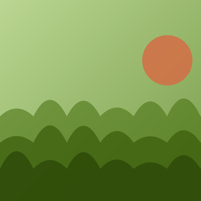
<div class="d-flex flex-wrap align-items-center justify-content-center gap-3 p-3 h-100" style="min-height:200px">
  <div class="fx-blur-focus d-flex gap-2">
    <img src="../assets/img/square-2.svg" alt="First gallery item" class="rounded-3 object-fit-cover" style="width:82px;height:110px"><img src="../assets/img/square-4.svg" alt="Second gallery item" class="rounded-3 object-fit-cover" style="width:82px;height:110px"><img src="../assets/img/square-6.svg" alt="Third gallery item" class="rounded-3 object-fit-cover" style="width:82px;height:110px">
  </div>
</div>

/* CSS (already in assets/css/effects.css) */
.fx-blur-focus > * { transition: filter .4s ease, opacity .4s ease, transform .4s ease; }
.fx-blur-focus:hover > :not(:hover) { filter: blur(3px) saturate(.6); opacity: .65; }
.fx-blur-focus > :hover { transform: translateY(-4px); }
@media (prefers-reduced-motion: reduce) {
  .fx-blur-focus, .fx-blur-focus::before, .fx-blur-focus::after, .fx-blur-focus *, .fx-blur-focus *::before, .fx-blur-focus *::after { animation: none !important; transition: none !important; }
}3Duotone Effect
Turns any photo into a two-colour print in the theme colours; put the class on a wrapper around the img. Class: fx-duotone-effect
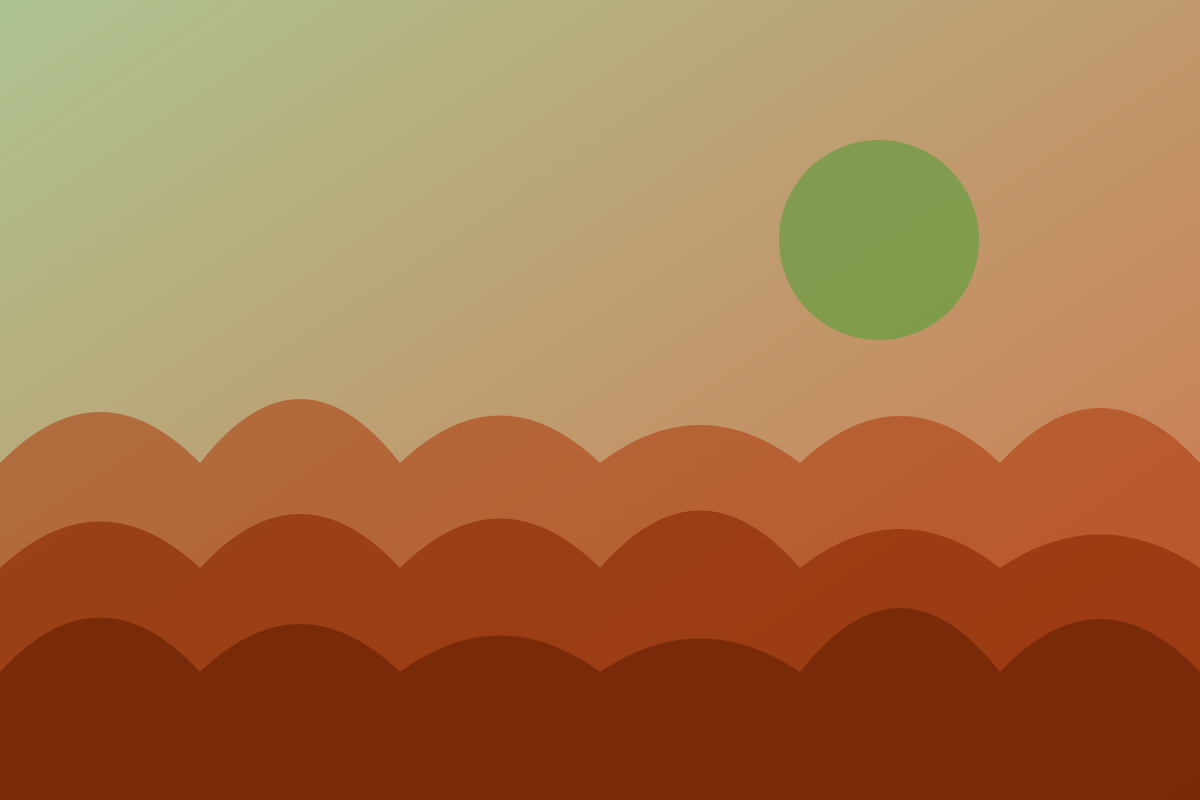
<div class="d-flex flex-wrap align-items-center justify-content-center gap-3 p-3 h-100" style="min-height:200px">
  <figure class="fx-duotone-effect rounded-3 mb-0">
    <img src="../assets/img/photo-6.svg" alt="Duotone photo" class="object-fit-cover" style="width:210px;height:145px">
  </figure>
</div>

/* CSS (already in assets/css/effects.css) */
.fx-duotone-effect { position: relative; display: inline-block; overflow: hidden; isolation: isolate; background: var(--wt-accent); }
.fx-duotone-effect img { display: block; filter: grayscale(1) contrast(1.2) brightness(1.1); mix-blend-mode: multiply; transition: filter .5s; }
.fx-duotone-effect::after {
  content: ""; position: absolute; inset: 0; pointer-events: none;
  background: var(--wt-primary); mix-blend-mode: lighten; transition: opacity .5s;
}
.fx-duotone-effect:hover::after { opacity: 0; }
.fx-duotone-effect:hover img { filter: grayscale(0); mix-blend-mode: normal; }
@media (prefers-reduced-motion: reduce) {
  .fx-duotone-effect, .fx-duotone-effect::before, .fx-duotone-effect::after, .fx-duotone-effect *, .fx-duotone-effect *::before, .fx-duotone-effect *::after { animation: none !important; transition: none !important; }
}