


Style guide
The colours, type, shapes and pictures of Yaraly Works in one place.
Brand
 Yaraly WorksYaraly Works
SaaS & Software - Modern and focused: indigo, violet and blue, the product on screen.
Palette Arctic · Aurora Glass style · pictures: Gradient mesh with saas & software subjects · fonts Unbounded and Figtree
Colours
Every colour is a token in assets/css/theme.css (--wt-primary ...). The contrast of the text colours is shown against the page; WCAG AA needs 4.5:1 for text.
Light mode
Dark mode
Type
Unbounded
Headings
Figtree
Text, buttons and forms (Google Fonts)
Ship faster with less busywork
Everything a busy team needs
How remote teams keep projects on track
Notifications only reach people when their input is needed. Everything else waits in a quiet daily digest.
We measure success by how many customers come back and tell their friends. Your data is encrypted, backed up daily and hosted in the region you choose. Our open API and ready-made integrations fit into the stack you already have. Automations take care of the repetitive steps, so people can focus on real work.
Real-time dashboards show what is on track and what needs attention.
Corners and depth
--wt-shadow--wt-shadow-lgComponents
Pictures
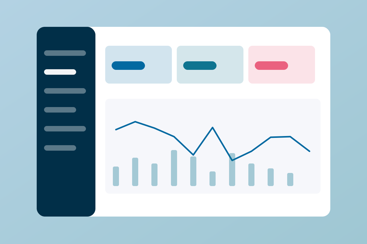
Gradient mesh in the template colours, with saas & software subjects. Every product picture shows its product. Replace them with your own photos of the same size (see PHOTOS.md for the photos of the live demo).






Design files
design-tokens/tokens.json- every token in the W3C Design Tokens format: in Figma, install the Tokens Studio plugin and load the file; Style Dictionary turns it into code for other platforms.design-tokens/style-guide.svg- this page as a board: drag it into Figma, Sketch or Illustrator and every swatch, text and shape stays editable.design-tokens/tokens.css- the same values as CSS variables for other projects in the brand.